I love ny
A campaign for New York State, drawing from and expanding upon the iconic "I ❤️ NY" logo, creating dynamic and engaging images showcasing the myriad activities New York State has to offer outside city limits.
Concept, copy, layout, and design by Angel Eduardo. Photographs from the NY State website.
Engines
Album Artwork
Blue Food's debut full-length album, released August 2012.
Cover Artwork by Anastasia Panagakos.
Concept, layout, and design by Angel Eduardo.
Front Cover Art
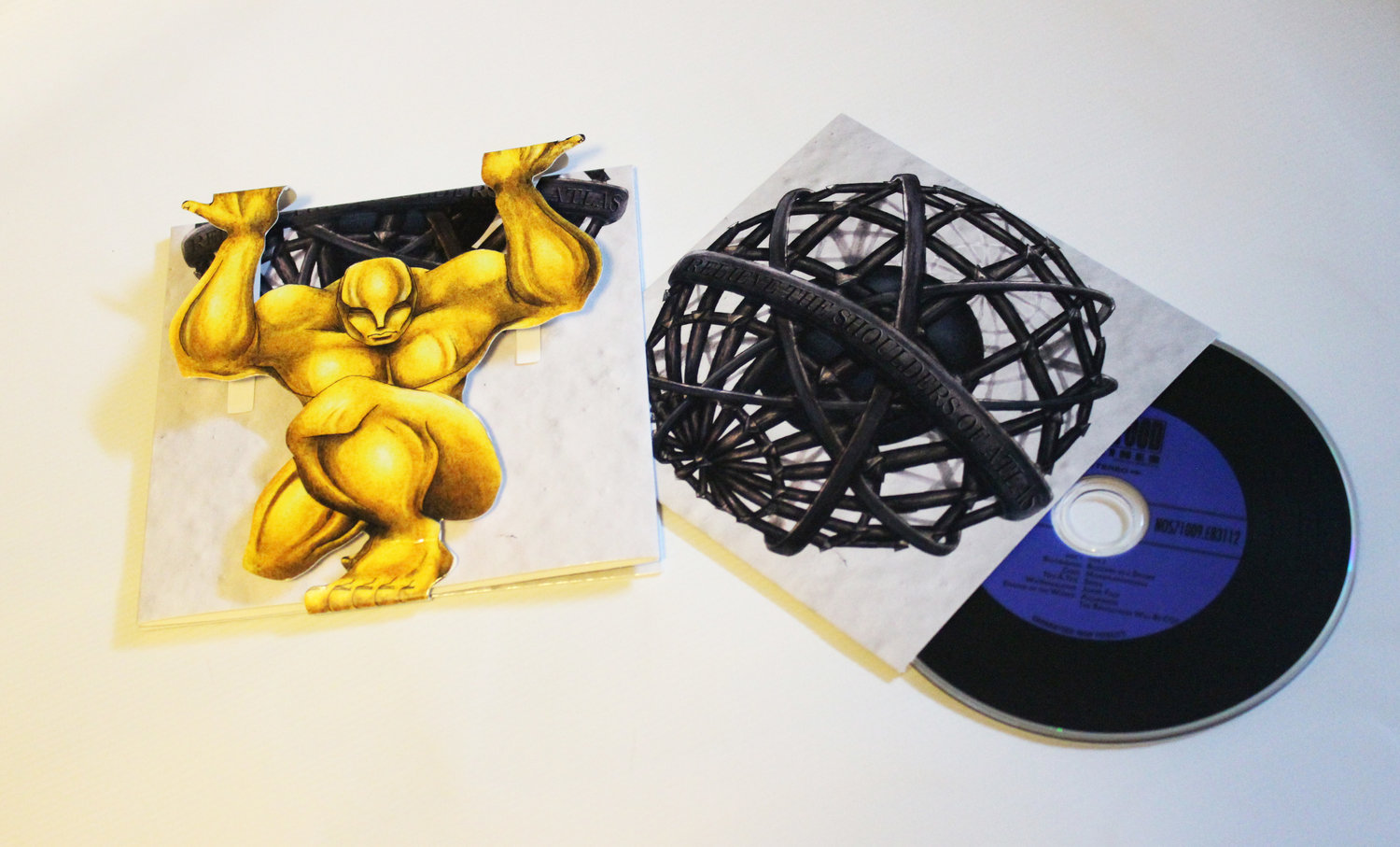
The Engines cover artwork was designed to be an extension of the album's ambitious lyrical and musical structures and themes, a brand new fusion of a retro aesthetic.
The line, "Relieve the shoulders of Atlas," from the album's centerpiece, "Engine of the World," is visually represented in the artwork, depicting the mythic figure Atlas in his classic pose.
Die-cut 5-panel Wallet, Sleeve, and Vinyl CD
The album is a custom trifold sleeve design with a die-cut figure of Atlas, made in the style of the often avant-garde 1970's prog-rock LPs.
The CD is custom printed and designed to look and feel like vinyl, complete with grooves and a jacket sleeve, in keeping with the band's retro roots.
Pop-Up View
When the album is unfolded, tabs on the die-cut Atlas' hands can be slid into the sleeve, and the artwork on the jacket can be lined up with that on the back panel to create a three-dimensional version of the cover art.
In keeping with the album's themes of idealism, intellectual progress, and activism, the artwork itself demands a hands-on approach. When a listener pulls the sleeve from the jacket in order to listen, they are literally relieving the shoulders of Atlas, bringing the band's call-to-action full circle.
New Old Stock
album artwork
Blue Food's demo EP, released June 2009.
Cover Photography by Sarah Sturges.
Concept, layout, and design by Angel Eduardo.
Front & Back Jacket Cover
"New Old Stock," refers to merchandise being offered for sale which was manufactured long ago but that has never been used. As a 1970's prog-rock-inspired 7-piece funk fusion group, Blue Food found the term a fitting title for their demo EP.
Printed in a limited run of just 100 copies as an introduction to galvanize interest from promoters and booking agents, New Old Stock was conceptualized as the band's unboxing. The artwork depicts the members tucked into packing peanuts along with their instruments.
"Fork and Knife" Blue Food logo created using the free downloadable font "Badaboom BB."
Paper Packaging with Twine, Disc Jacket and CD
The CD jacket was individually hand-wrapped in brown postal paper and twine, rounding out the "unboxing" and "packaging" concept. A customized variation on the typical "Fragile" sticker was created to drive the theme home and give potential listeners a clue as to the packaging's "Funky" contents:
The goal was to elevate this "demo" beyond the more commonplace, Sharpie-scribbled CD-R, separate the band from its peers, and signify the detail-oriented, high-concept, and ambitious music that would follow.
Concert posters
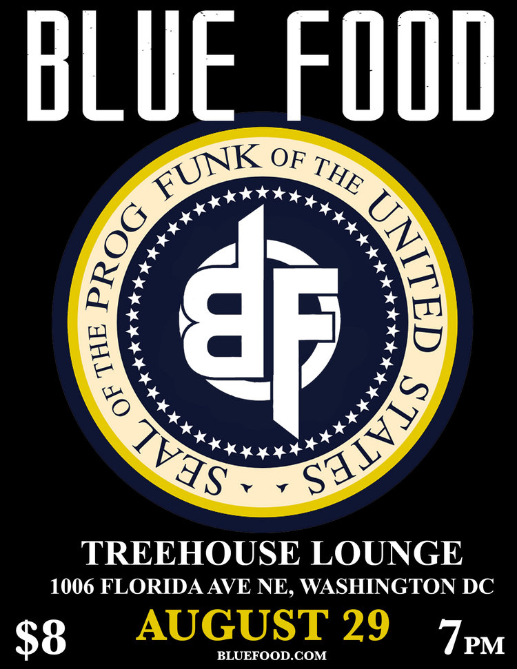
Every Blue Food gig was advertised with a unique concert poster, often with custom commissioned artwork, disseminated online and in print.
"Funk for Mind and Booty" & "Prog Funk" tags, concepts, layouts, and designs by Angel Eduardo.
The recollective
A group of New Jersey writers and artists, formed at New Jersey City University in 2009. What began as a monthly workshop developed into a more substantial enterprise, hosting public readings and workshops, and sponsoring an elementary school writing contest.
The name The ReCollective was coined to signify the often autobiographical work which served as the foundation for the group's output.
“The ReCollective” name and logo by Angel Eduardo.
The Lotus Logo was developed as a symbol and sigil, for both promotional and personal use.
Inspired by by Confucian Scholar Zhou Dunyi's quote, "I love the lotus because, while growing from mud, it is unstained."
The lotus in a circle represents the bond between the writers and the creation of art to sublimate trauma and pain, which acts to "unstain."


